10 lessons from our startup re-branding (and how we found our real selves along the way).
When we launched Xceed in 2009 our brand development equalled a fuzzy brainstorm in a messy living-room filled with empty vodka bottles and dreams. We were absolutely sure that we had the clear picture in mind. It was immediate. It was rock-solid obvious. No need to mention, we were wrong.

Xceed - WOW Pool Party, Castellon, 2016
As time went by, Xceed’s soul became a cocktail of desire to change the world, create art, make friendships and live nights to remember. It seemed to make sense, and it probably did. Until, one day, the company outgrew its students’ flat, and its dreamy friends evolved into real managers. It was an epiphany. We had spent so much time focusing on growth, metrics and KPIs that, suddenly, we realized we didn’t know WHY we were there doing what we were doing.
Xceed’s brand was null and our objectives too generic. Each new team member walking through the office’s entrance was tilting at his own windmills. After all, 10 years passed since our initial “how should we call this?”, “what’s our tagline?”, “how are we gonna change the world?”.

Xceed Team. Montpellier, 2014

Xceed Season Closing Event. Valencia, 2015

Xceed Team Retreat. Ibiza, 2017
It was about time to craft a specific vision, a clear message that would leave no space for interpretation. And so we began a search for our real selves.
Step 0: How to brand?
As a bootstrapping-born startup with low-resources and a strong capital-efficient-DNA we had to face the uncomfortable decision of favoring short-term growth over the principles we believed in. Far too often. We always loved branding & design, we just couldn’t afford them.
Before I go forward, here are some key facts on the why every startup should prioritize branding:
- 81% of consumers find the brand value to be a deal breaker in their purchasing decision
- brands with a clear mission impacting society register a 45% higher rate of loyal customers (Edelman Trust Barometer Report)
- 1 in 5 lost deals in our b2b sales pipeline (we built a SaaS for clubs & festivals called Nightgraph) blamed the lack of brand in the industry as cause for postponing the collaboration.
- our internal employees happiness score grew 14% since we started focusing on our brand
All this makes sense. So, having clear why we urgently needed to work on our identity, it was time to learn how to. First of all, what is a brand? Typeform’s definition nailed it.
“Branding is a set of written and visual tools to express a company’s personality and project a unique vision.“
Now, the easiest way is probably to rely on external agencies to drive this complex creational process. In our case, after scarce results in finding the right marketing agency (unsatisfactory or out-of-budget proposals) we opted for an internal re-branding process. We knew that it was not gonna be an easy path, but we were so passionate about it that a team of 8 people from different departments was spontaneously created to tackle this challenge. We called it the brandstormers, and its first task was to spend as much time possible listening to people, employees, friends, customers, investors and strangers.
LESSON #0: PRIORITIZE BRANDING AS EARLY AS POSSIBLE.

Our brandstorming team. Xceed HQ. Barcelona, 2019
STEP 1: Find inspiration
Before defining our brand guidelines, we wanted to see what the big boys were doing: Airbnb & Uber brand/design system cannot be missed. During this phase we took note of all the assets (whether graphical or abstract) we had to work on and set the pace for our rebranding. Here’s how our roadmap looked like:
Month 1: Collect feedback. How are we perceived externally (b2c & b2b customers) and internally (employees & friends).
Month 2: Work on our values, mission and vision. Research our stakeholders.
Month 3 & 4: Define on our tone, photography, illustration, logo colors and other graphical assets.
Month 5: UX/UI sprint and implementation of the new guidelines on our digital product lines.
Month 6: Internal team feedback and reiteration / adjustments.
Month 7: Launch!
LESSON #1: PLAN AHEAD

Xceed HQ. Barcelona, 2019
STEP 2: Nail your vision and mission.
This was by far the hardest part in the process. We sat down and had so many dreams in mind but we constantly got stuck on the same doubt: how idealistic (or unrealistic) should our vision be? Should our vision be eternal or should we focus on what we really do today? We needed a clearer purpose.
Ever heard the story about the three men building a church?
“A man came across three masons who were working at chipping chunks of granite from large blocks. The first seemed unhappy at his job, chipping away and frequently looking at his watch. When the man asked what it was that he was doing, the first mason responded, rather curtly, “I’m hammering this stupid rock, and I can’t wait ’til 5 when I can go home.”
”A second mason, seemingly more interested in his work, was hammering diligently and when asked what it was that he was doing, answered, “Well, I’m molding this block of rock so that it can be used with others to construct a wall. It’s not bad work, but I’ll sure be glad when it’s done.”
”A third mason was hammering at his block fervently, taking time to stand back and admire his work. He chipped off small pieces until he was satisfied that it was the best he could do. When he was questioned about his work he stopped, gazed skyward and proudly proclaimed, “I…am building a cathedral!”
What kind of cathedral are we building? What motivates us? What makes us forget about time and what purpose do we enjoy working for?
You want to hire people who believe in your mission and not the people who believe in a cooler office or greater salary.
This means that you need to truly believe in making a difference for people to passionately follow ideals. Nobody sacrifices his life-time for another ticketing service for music events. So we focused on what we love about going out. Community, music, friendship, arts, performances, discovery, creativity. It took several meetings, and lots of coffees. Once ready for our final call we used our decision making framework to reach a final result that would embed our passions and purpose:
OUR VISION
Bring people together to live memorable going out experiences.
OUR MISSION
Xceed exists to create a world where everyone can live extraordinary experiences by joining authentic music events and connecting with inspiring people.
LESSON #2: SET GOALS WORTH FIGHTING FOR

Xceed Sponsored Event, Comunidad Valenciana, 2016
STEP 3: Define your values.
Values define who we are, not only as a brand but as a team of individuals with the common goal of becoming nothing less but THE global going-out community. We started by making not only a list of things that we loved, but also of feelings we hated. This helped a lot in realizing, for example, that we all disliked arrogance, selfishness and pessimism. Why was this important? Because there is nothing new in supporting honesty, integrity, transparency and so fourth. But we needed to find the 5-10 distinctive words that told people our story. Paradoxically, thinking about what we were not, helped us getting a clearer picture of what we wanted to be.
Once we brainstormed about 92 values we all believe in, we went onto grouping them, and eliminating the synonyms. Here’s how it looked like half-way through:

Out of the 53 final values, we voted out the weakest and kept the top 22. It was now time to involve the full team into the process. We set up a quick survey and asked every team member to pick his top 5 values.
Here were the 10 most-voted:
Creativity
Passion
Ambition
Excellence
Fun
Curiosity
Boldness
Perseverance
Thoroughness
Customer Focus
LESSON #3: HIRE AND FIRE BASED ON YOUR VALUES

Our first partner club - LA3, Valencia,
STEP 4: Move from values to principles
We proudly stared at our final 10 values before looking at each other. Then, finally, someone said “Damn these values are boring”. We needed something bolder. That’s why we moved to 5 value-based principles.
1. Moderation is fatal. Think beyond rules.
We are fearlessly bold. We believe it takes courage to write change.
2. Be curious. Everyday. About everything.
We are the discoverers of the future and we take nothing for granted. We listen carefully to every customer, we forge trends, we experiment.
3. Have no plan B.
We don't get too many things on our platter. Focus and ambition for excellence are our everyday's snack. Perseverance is what takes us from A to Z under any circumstance. We never leave details to fate.
4. Inspire.
We envision a sustainable world where empathy and sense of community will drive humankind's passion for creativity and arts.
5. Don't ask if the party is going to be fun.
Only perfect results count. It won't always be pretty. Make sure to have a good time throughout the journey.
LESSON #4: PRINCIPLES ARE KEY IN CREATING A COMMITTED AND ALIGNED TEAM.

Friday evenings at our old office. Barcelona, 2018
STEP 5: Refresh your logo.
We always struggled with our logo. Throughout these 10 years, it has always been a love/hate relationship. It was time to analyze our past mistakes and go forward. Here’s Xceed’s logo history over its decade:

We decided to get rid of any shape or symbol and fully focus on our main identity: our own name. Exceed, coming from the latin ex-cedere, to go beyond, was in itself the purpose we standed for. To outshine, to go the extra mile, to experiment, to be extroverted and live a life filled with curiosity.

Xceed HQ. Barcelona, 2019

We built our new logo on the Avenir Font. Using its strongest weight, Black, to convey our bold DNA, and the italic form to perfectly blend the sharp strokes of the “x” with the rounded traits of the other letters, creating a musical dynamism whose recurring sound wave can be seen moving at the bottom of the final letter “d”. Customized optical kerning, defined clearspace and delineated placement, all make Xceed’s bold character instantly recognizable at all sizes and contexts.


From sub-brands, partnerships and co-marketing, to products and software, we build Xceed’s equity through a consistent brand architecture.
Xceed’s business software and data dashboard, Nightgraph, stands aside this general rule. Nightgraph’s own identity is reflected by its distinctive color and uppercase logo.
The exagonal shape - a hive - represents our community of clubbers and party-goers (the bees), reaching out for their honey (music) at the best venues (the hives).
LESSON #5: SIMPLIFY.
STEP 6: Colors!
Colors say a lot about your personality and make our corporate identity consistent and recognizable throughout all brand communications. The early 20th century avant-gard expressionism and its post world-wars abstract forms strongly inspired Xceed’s color palette, sharing our desire to express the meaning of emotional experience and exceeding physical reality.

Van Gogh - Starry Night

Edvard Munch - The Scream

Jackson Pollock - Convergence
Munch’s reds, Van Gogh’s Starry Night and Pollock’s dancing canvas, all blends into our color style guide.
Our primary brand color went back to the origins and stayed truth to its original dark color representing the night. Lastly, we invented a new “color”, the “Xceed color”, a dotted-mix of all colors, to be used for bold assets.

Xceed Primary Colors

Text Colors

Accent Colors

Infrastructure Colors

Secondary Colors

Our text colors focus on clarity of reading and consistency with the brand’s palette. The accent color is used for emphasis on specific elements and calls to action. It should be used for moments of registration, checkout, support, assurance, and delight at moments of interaction between a user and the brand.
LESSON #6: THE ACCENT COLOR IS THE NEW BLACK.
STEP 7: Create the right mood board
Our photography inspires both our business and consumer audiences to live the best nights of their lives. Photographs and videos conveys the motivation to live extraordinary experiences and their emotional payoffs. The body movements and the connections amongst people. The electric charge in the clubs’ air during the closing song. Our photography is not there to show subjects, rather to tell the stories behind them.


Preference over natural colors and analog photography. Individuals are in lively energetic moments and convey a strong and positive emotional impact. Subjects should not feel aware of the camera, as if the viewer is unobtrusively brought in to an intimate moment.
Calm, still, flowing, and simmetric photography should be used to create a contrast between the message and the background. Nature, as well as industrial sceneries should be the preferred subjects of our background images.

LESSON #7: MAKE SURE YOUR MEDIA ARE CONSISTENT AND ALIGNED TO YOUR BRAND IDENTITY
STEP 8: Typography
Typography is a key element to communicate a unified personality for Xceed.
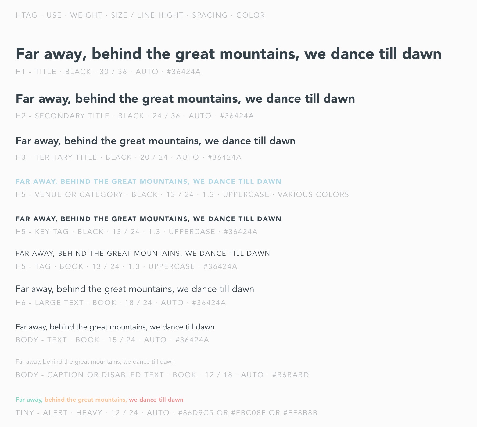
Digital Typography Guidelines for mobile devices
Our web typeface is Avenir, used in different weights: Book, Heavy and Black. To ensure brand consistency throughout the user journeys on multiple devices and operative systems, our native Android and iOS Apps share the same patterns with our web mobile interface. When using our typeface on both desktop and mobile interfaces, we always keep the number of font sizes to a minimum.
LESSON #8: GET THE TECHNOLOGICAL DEPARTMENT ON BOARD AND CREATE A COMPANY DESIGN/UI LIBRARY BEFORE CREATING ANY DIGITAL PRODUCT
STEP 9: Time to get a tagline
Once our tone and media guidelines were ready, we moved onto tag-lines, motto and other marketing assets.
We decide to spend some time reviewing our old marketing campaigns, flyers, posters, digital banners and media that we had produced over the last decade.
To give you an idea of our early works produced between a university class and another, let me share with you one of our most embarrassing, movie-maker + early smartphones recorded promo video. Our 2012 masterpiece crafted for the Mayan end of the world date, when we set up 4 interconnected parties in 4 different countries:
We looked back at our old “RISK” or “Live Amazing Nights” campaigns with affection. But it was time to move on. So we started asking ourselves the following questions:
What do we do?
What do we all have in common?
What unifies us?
What makes us equal?
We needed a tagline that was: SIMPLE, TIMELESS AND POSITIVE. A tagline that could be applied to diverse situation and events. That transmitted our sense of community. That pushed people to action. And that characterized our purpose and mission. We had hundreds of discussions and proposal and then went back to simplicity. It was right there, all along.

What we love about WE GO OUT was not only the sense of belongingness, boldness and happiness. It was its simplicity, it was the perfect form to be applied with different situations and occurrences. “WE GO OUT TONIGHT” “WE GO OUT IN SÃO PAULO””WE GO OUT WITH PRIDE”, etc… Any occasion could adapt and become part of the tagline. And for an event-oriented community this means we’ll be able to use this trick A LOT.
LESSON #9: SEE LESSON #5.
STEP 10: UX/UI or apply all of the above to your product
Last but not least, it was time to implement all these beautiful thoughts, values, colors and images to the core connector with our community: our product.
As a tech startup, we deal on a daily basis with different digital interfaces for diverse users in global contexts with more browsers on more devices with more screen-sizes and more capabilities than ever before.
It was time to kill our Frankenstein-product of different fonts sizes, colors, buttons and shapes and implement a beautiful design system from scratch.
Atomic Design is key in creating & transferring UI into the development workflow with speed and consistency.
Chemistry-inspired atomic design methodology is a pretty straightforward concept:
Atoms are the foundational blocks of our pages that can’t be broken down anymore before losing their functionality. They include the most basic of HTML elements like inputs, buttons, form labels, and so on.
Molecules are groups of atoms combined and correspond to things such as search forms (which are basically a form + a button + an input combined).
Organisms are groups of simple UI elements working together toward a common goal. For example, a search form + a logo + a navigation list = a header.
Templates are groups of organisms functioning together to create page-level objects that articulate a design’s structure.
Pages are instances in which we can see what a UI looks like with text, images, and media in place.

Atomic Design - via bradfrost.com
So we started by designing our atoms and then move forward to our core pages redesign. In this, we made clear what our final objectives had to be:
Frictionless and memorable UX. Applied to our industry this meant also finding ways for users to live customized experiences (electronic music lovers don’t want to land on a reggaeton event and vice-versa).
Data driven
Consistent, beautiful, minimal UI.
SEO first
Mobile first

Old web (2016) vs. New web (2020)

Old App (2017) vs. New App (2020)
LESSON #10: CREATE A CLEAR DESIGN SYSTEM TO ENSURE CONSISTENCY
Conclusion: Trust your guts.
Only looking back at these 6 months spent modeling our real identity with the team was a truly self-discovering journey. Somehow I am really happy that we decided to work on this project internally.
Did we do things the right way? Probably not.
There’s still a lot to do and this must be just the beginning of an ongoing -360degrees- commitment. One thing is sure: the actual value the process brought us was well worth every meeting, discussion, and disagreement.
You will know when it’s the right time to (re)brand your company, hopefully you’ll be smarter than us and give it the focus it deserves earlier down the road. When you’ll do, trust your guts, involve everyone, experiment and don’t be scared of mistakes. A brand is never gonna be perfect. Try, improve and commit. Lastly, but most importantly, make sure to have a good time throughout the journey.